Project Overview
At Meta, access control policies were scattered across Okta, Active Directory, badge systems, and a handful of internal tools. If an admin wanted to grant a contractor access to a building, an app, and a specific email domain, they were often filling out multiple forms or filing tickets with different teams.
I designed a single platform where policy administrators could create, edit, and monitor all of those rules in one place. The tool covers the full lifecycle: drafting a policy, selecting which systems it applies to, configuring app-specific requirements (like AD group memberships or SRT roles), and tracking exactly who changed what after it goes live.
The Challenge
Users need to:
- See the status of every active policy without digging through spreadsheets or Slack threads
- Create precise access rules across multiple backend systems without writing code
- Understand what a policy actually does months after it was created
- Disable or edit policies safely, with a clear record of what changed and when
Key challenges:
- The domain is genuinely complex. A single policy might touch Okta, Active Directory, badge readers, and vendor portals — and each system has its own vocabulary. AD cares about group membership and email domains. SRT cares about verticals and permission roles. The UI had to respect those differences without overwhelming the person configuring them.
- Mistakes are expensive. A misconfigured policy could lock someone out of their tools or, worse, grant access to the wrong person. The interface needed to make the rules feel concrete and reviewable, not abstract.
- The existing workflow was fragmented. Admins were used to a patchwork of tools. We weren't just designing a nicer form; we had to convince them that one tool could actually replace four.
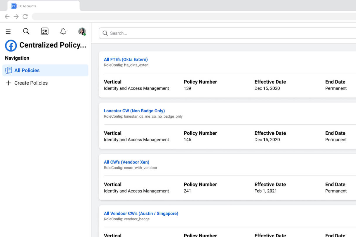
- Dense information, small screens. Policy cards need to show status, policy numbers, effective dates, owners, and role configs at a glance. A standard data table would have been unreadable.
My Role
As the UX Designer, I led the design of this internal enterprise tool from concept to high-fidelity interface. I owned the interface from early sketches through the final high-fidelity screens.
My day-to-day involved:
- Mapping out the policy creation flow with engineers to understand technical constraints (what the backend could validate in real time vs. what had to wait until publish)
- Designing the policy listing view, multi-step creation form, the access picker, and the app-specific obligation panels
- Building out the audit history modal so admins could see field-level diffs instead of guessing what changed
- Iterating on the navigation and information architecture after showing prototypes to the admin team
User Research
I started by shadowing three policy administrators for a few hours each. I watched them open Okta in one tab, an internal wiki in another, and a spreadsheet in a third just to confirm whether a single contractor still had badge access. That friction was the whole story.
A few things kept coming up:
- "I don't know who owns this." Policies were created by people who had left the team, and there was no clear owner field in the old system.
- "I thought I checked that box." The old tools had no validation step. Admins would publish a policy and only find out it was broken when someone complained they couldn't log in.
- "What does this even mean six months later?" Without descriptions or a change log, reverse-engineering a policy meant opening tickets and asking around.
I also reviewed a few enterprise IAM tools (Okta itself, Azure AD, some internal Meta tools) to see how they handled rule complexity. Most of them were either too simple to be useful or so powerful they required a certification to operate. We needed the middle ground.
The Solution
A policy list that actually tells you something
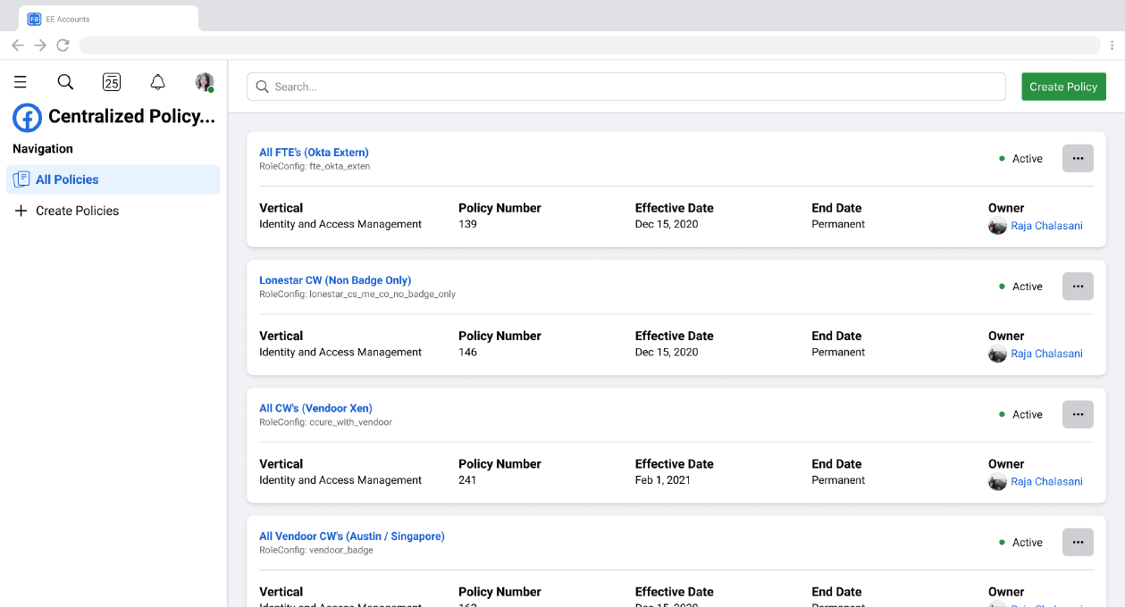
Instead of a dense table, I used a card-based layout. Each policy shows its status with a simple dot, the policy number, effective and end dates (with "Permanent" clearly called out so no one has to guess), and the owner's face. The RoleConfig ID is visible but de-emphasized — admins told me they sometimes search by those internal names, but they don't want them screaming for attention.
A creation flow that breaks complexity into pieces
The "Create Policy" form is split into logical sections:
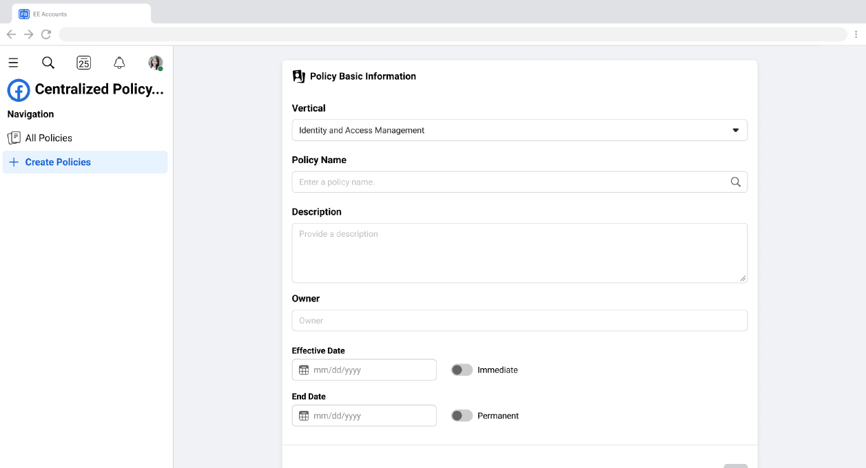
- Basic Info — Vertical, name, description, owner, and dates. I added toggles for "Immediate" effective date and "Permanent" end date because 90% of policies either start now or never expire. Forcing a date picker for every field was just extra clicks.
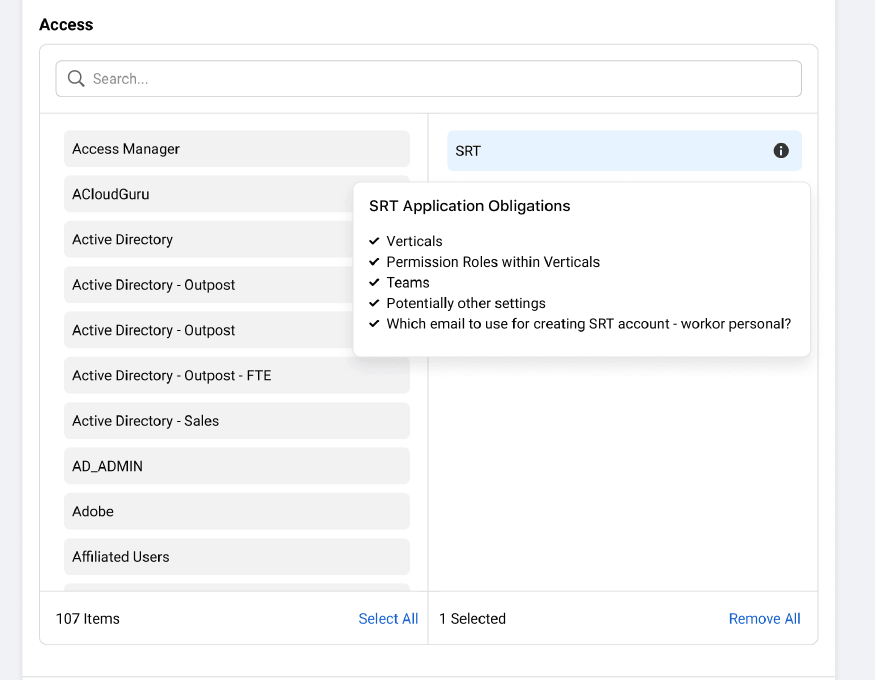
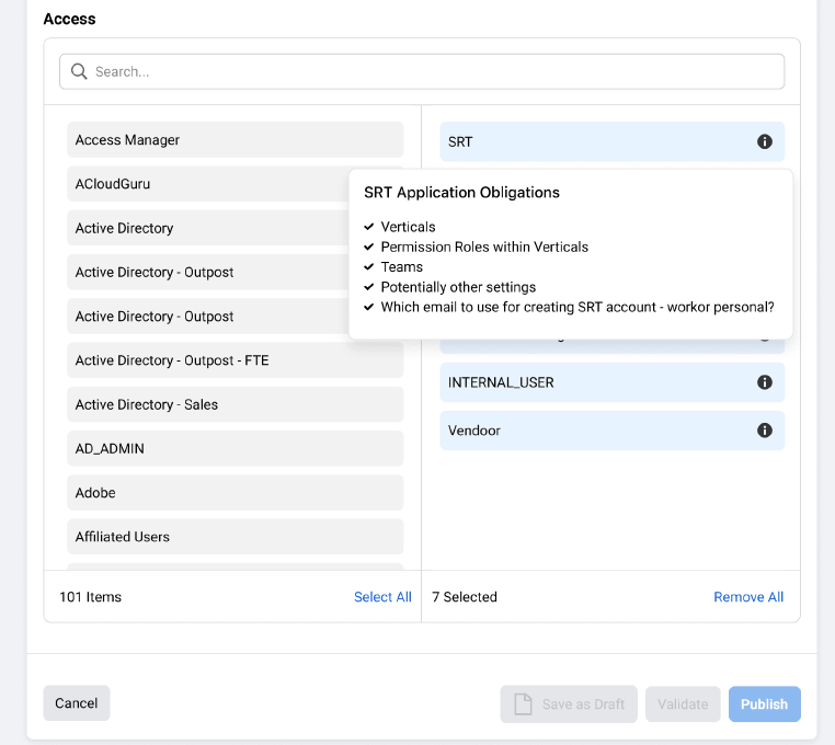
- Access — A dual-pane picker with search. The left side lists all 100+ connected systems. The right side shows what's selected, and each item has an info icon that reveals the specific obligations for that app (e.g., SRT requires verticals, permission roles, teams, and email settings). This was crucial — admins needed to know what they were signing up for before they selected an app.
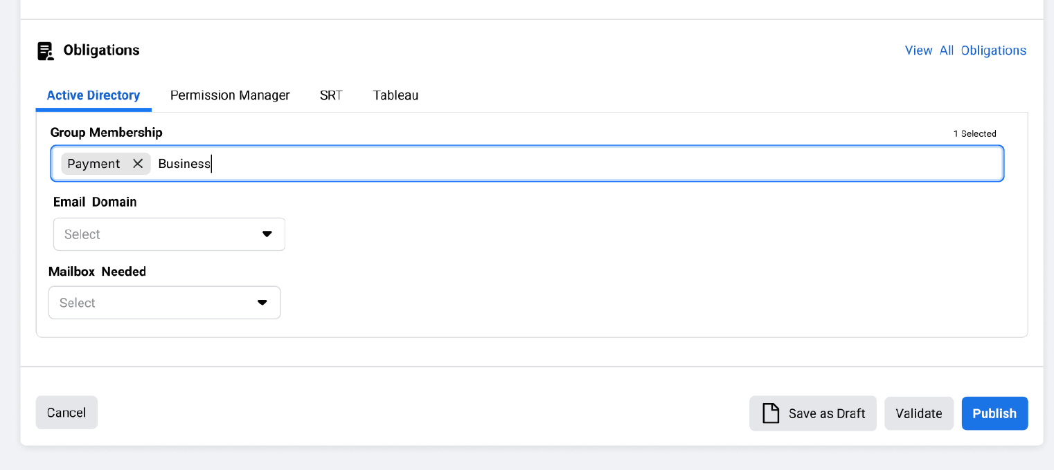
- Obligations — Once apps are selected, tabbed panels appear for each one. Active Directory gets group membership tags, email domain dropdowns, and mailbox settings. SRT gets its own role configuration. The tabs keep each app's requirements isolated and scannable.
Actions that feel safe
From the policy list, admins can open a card's overflow menu to Edit or Disable. There's no "Delete" in the primary flow — disabling is the safer default for a system where removing a policy could break access for hundreds of people.
An audit trail with context
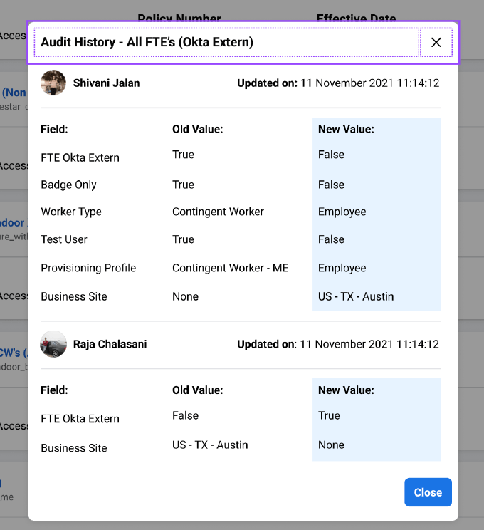
The audit history modal shows exactly who changed what and when. It uses a simple three-column layout: Field, Old Value, New Value. When Shivani Jalan flipped "FTE Okta Extern" from True to False, or when Raja Chalasani updated the business site, it's all there. No detective work required.
A draft-to-publish workflow
At the bottom of the creation form, admins can Save as Draft, Validate, or Publish. Validation was a big request — it catches misconfigurations before they go live, which saves the "oops, I broke badge access for an entire office" kind of panic.
Key Design Decisions
- Cards over tables: I tried a table first. It failed. With policy numbers, role configs, dates, owners, and status, the row height became ridiculous. Cards let the metadata breathe and scale better on different screen sizes.
- Immediate / Permanent toggles: Date pickers are fine for edge cases, but most policies are either effective immediately or permanent. The toggles reduce cognitive load and cut down on "12/31/2099" hacks that admins were using in the old system to mean "never ends."
- In-context obligation previews: When you hover or focus the info icon next to an app in the access picker, you see exactly what fields you will need to fill out later. This prevents the "select everything and hope for the best" approach we saw in early research.
- App-specific obligation tabs: Instead of one long form that tries to handle every possible system, obligations are grouped by app in tabs. This mirrors how admins think ("I need to set up their AD groups, then their SRT roles") and keeps the UI from becoming a wall of fields.
- Field-level audit diffs: The audit history does not just say "Policy updated." It shows the exact field, the old value, and the new value. In a system where a single boolean can affect thousands of users, that granularity is the difference between a five-minute fix and a five-hour investigation
What I Learned
Trust is the real feature: In enterprise tools, especially around identity and access, users are not looking for delight — they are looking for confidence. Every toggle, every validation message, every "Permanent" label is there to say "you can trust this." I spent more time on error states and confirmation patterns than I expected, and it was worth it.
Backend constraints are design constraints: I originally wanted a slicker, more visual rule builder — maybe something node-based. But the backend validated policies as structured configs, not visual graphs. Fighting that would have made the UI pretty and the engineering impossible. Designing with the data model, rather than against it, produced something we could actually ship.
Internal tools deserve the same rigor as consumer products:It is easy to assume that because users are "captive" (they have to use this for their job), you can cut corners on UX. The opposite is true. These users are often under pressure, handling high-stakes changes, and using your tool alongside five others. Clarity is not a luxury; it is a requirement.
The "simple" problems are often the hardest: The feature I am proudest of is not the flashiest — it is the audit history modal. It took a lot of negotiation with engineering to get field-level tracking exposed in the UI, but it is the thing admins thanked us for most. Sometimes the best design work is just making the invisible visible.