Project Overview
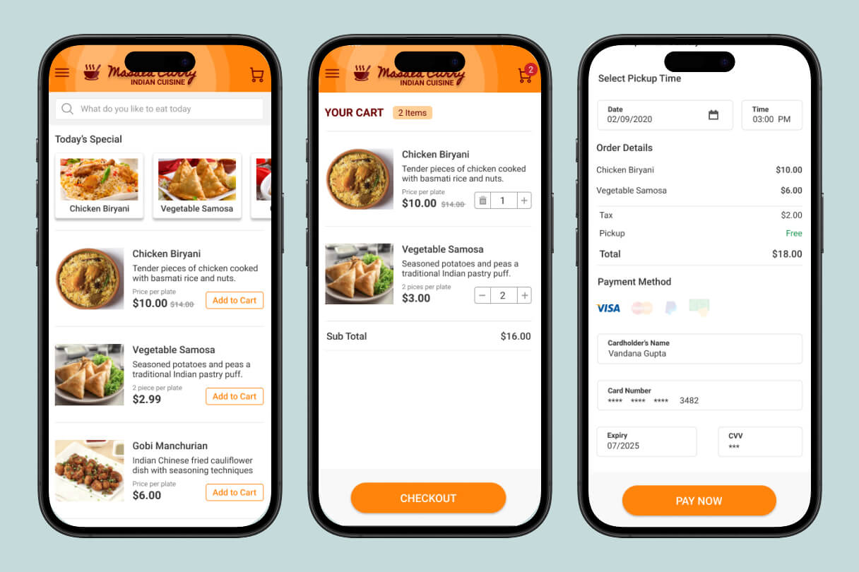
I designed a mobile app for Masala Curry, a local Indian restaurant, to make ordering food smooth and enjoyable. The app lets users browse the menu, add items to cart, choose pickup or delivery, reserve a table, and complete payment with a clean, modern flow. Everything was built with a warm orange color palette to match the restaurant’s vibrant Indian cuisine branding.
My Role
I was the sole UX/UI designer for this project. I handled everything from start to finish:
- Created the full user flow and information architecture
- Designed all screens including home, menu, cart, checkout, and confirmation
- Built an interactive prototype in Adobe XD
- Focused on making the experience fast, friendly, and frustration-free for hungry users
The Challenge
Food ordering apps can feel cluttered, slow, or confusing — especially when users are hungry and just want their food quickly.
The main challenges were:
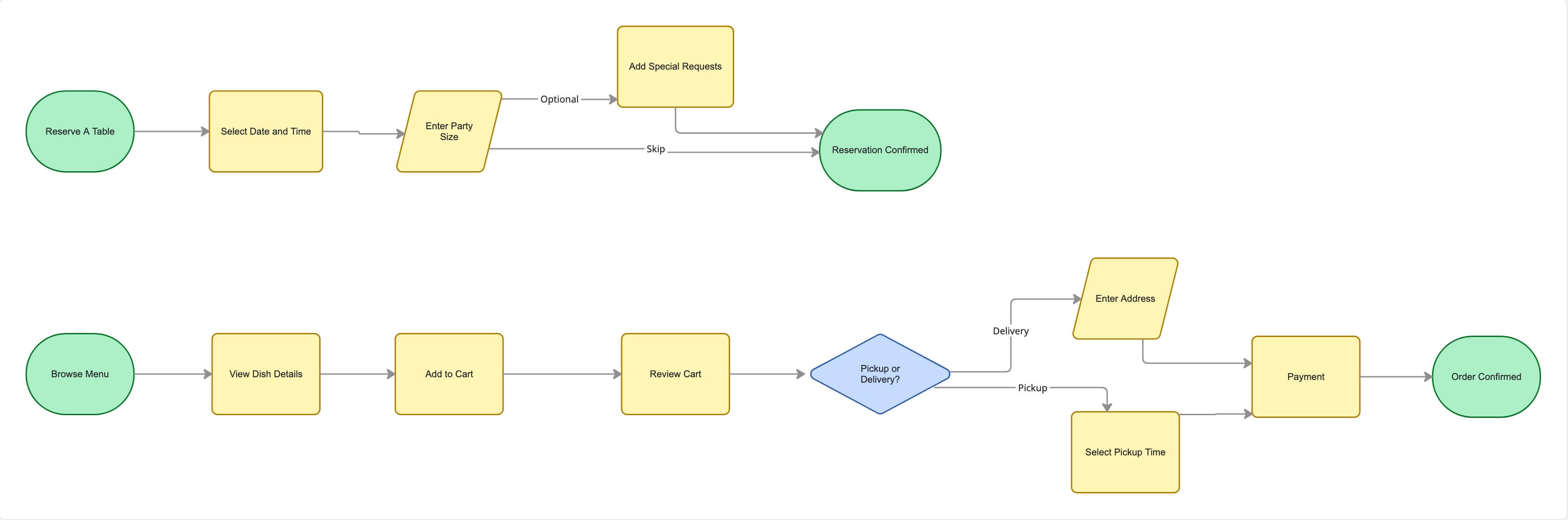
- Making the ordering process simple for both pickup and delivery options
- Handling cart management, quantity changes, and item deletion smoothly
- Creating a seamless checkout experience with payment details
- Designing a clean table reservation feature without adding extra steps
User Research
I started by studying popular food delivery apps like DoorDash, Uber Eats, and Grubhub to see what works well and what frustrates users. I also looked at local restaurant apps to understand how they balance branding with functionality.
Key insights I gathered:
- Users want fast browsing with clear photos and prices
- Cart editing (adding, removing, changing quantity) needs to feel effortless
- People appreciate having both pickup and delivery choices in one flow
- Confirmation screens should feel rewarding and reassuring
Ideation & Sketching
I began with quick paper sketches to map out the main user journeys: browsing menu → adding to cart → checkout (pickup or delivery) → order confirmation, plus the table reservation flow. This helped me keep the navigation simple and logical before moving into digital wireframes.
Wireframes
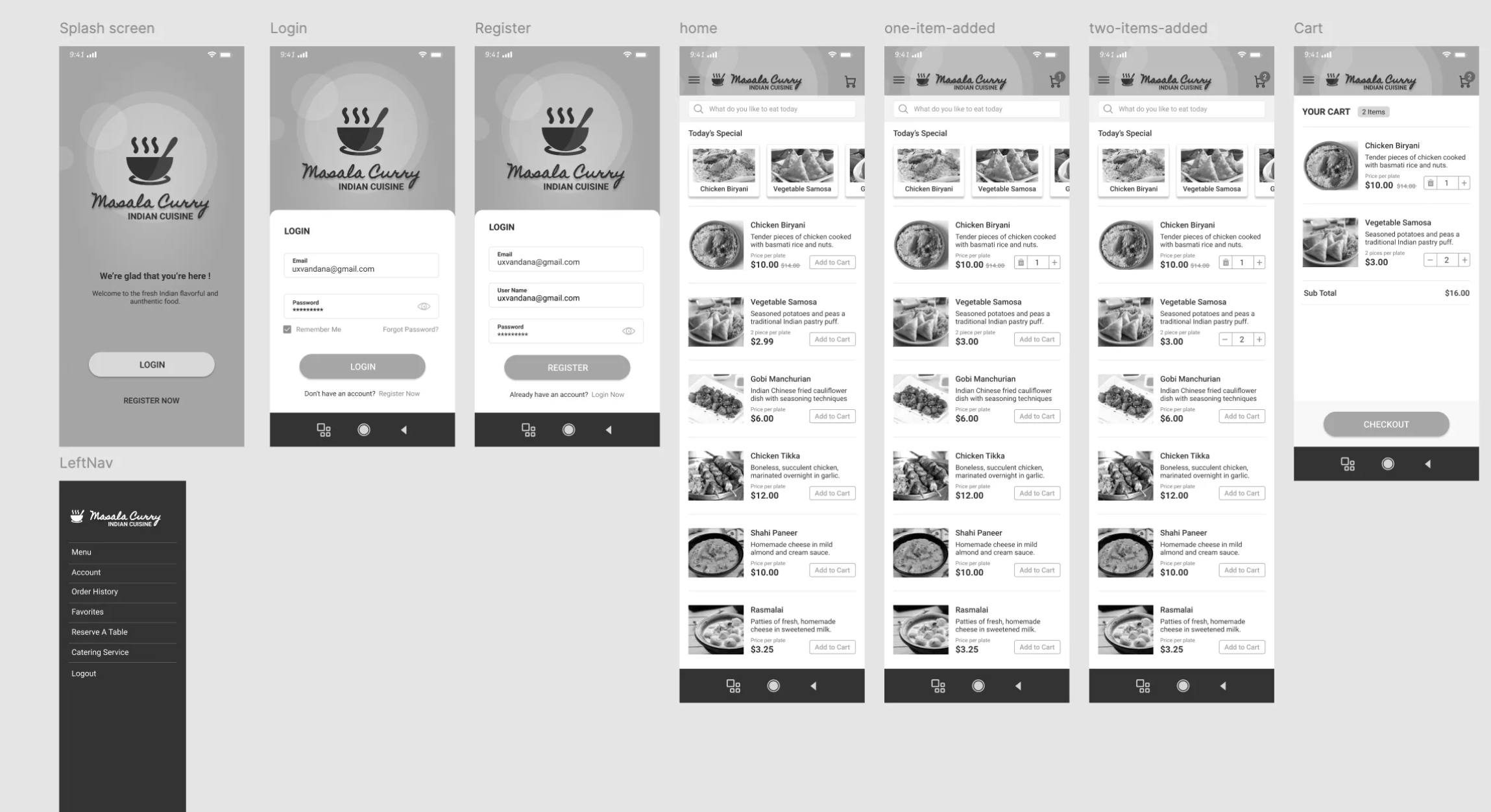
I started with low-fidelity wireframes to test the overall structure and navigation. This phase helped me refine the flow, especially how users move between menu, cart, and checkout without getting lost.
The Solution
The final app offers a warm, intuitive experience that feels fast and welcoming.
Key features include:
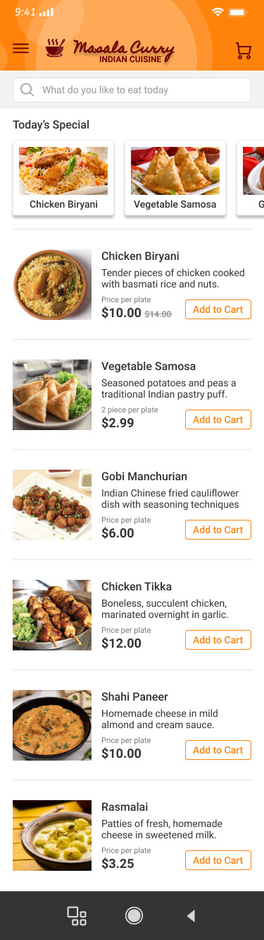
- Clean home screen with “Today’s Special” and easy menu browsing
- Smart cart with quantity controls and delete confirmation
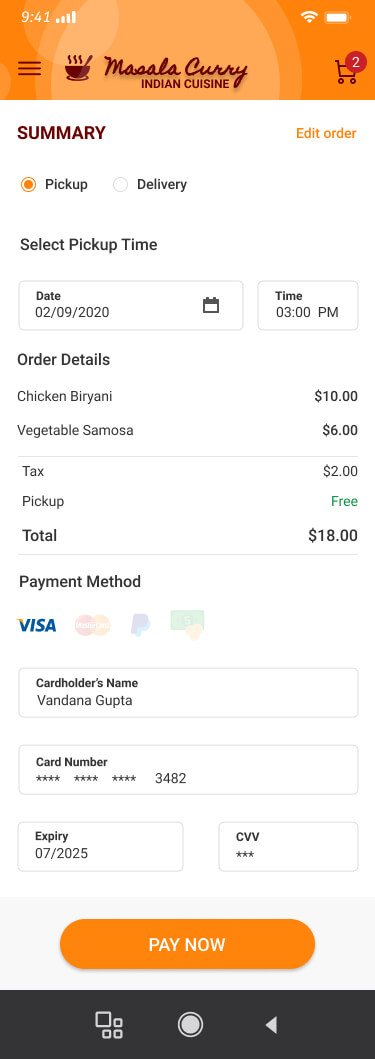
- Simple toggle between Pickup and Delivery with separate time selectors
- Straightforward payment screen with saved card details
- Clear order confirmation with order number and next-order discount
- Easy table reservation with location, date, time, and guest count
Design Evolution
Early designs had heavier text and more crowded layouts. Over time I simplified things by:
- Making food images larger and more appetizing
- Using consistent orange buttons for all primary actions
- Improving spacing and hierarchy for better readability
- Adding smooth micro-interactions like the delete confirmation modal
The visual style evolved to feel more vibrant and premium while staying easy to use on mobile.
Results & Impact
Since this was a concept project, success was measured through usability testing and flow quality. Friends and potential users who tested the prototype found the app easy to navigate and enjoyable to use.
They particularly liked:
- How quickly they could add items and checkout
- The clear distinction between pickup and delivery
- The satisfying confirmation screen with order number
Overall, the design created a friendly, efficient experience that matches the warm personality of Masala Curry while reducing friction in the ordering process.