Project Overview
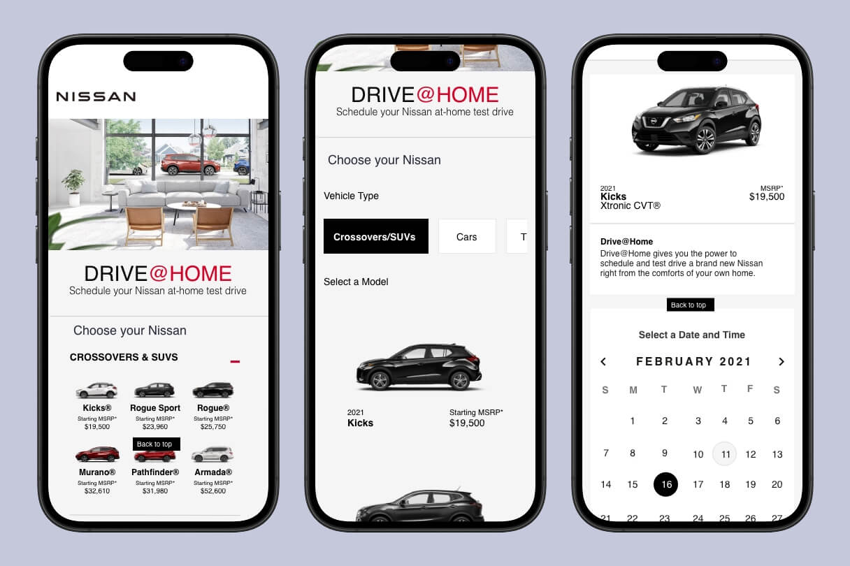
For this project, I redesigned the mobile experience for Nissan Drive@Home — a service that lets people schedule and complete an at-home test drive without ever stepping foot in a dealership. The goal was to make the entire process feel simple, trustworthy, and actually convenient from a phone. The flow starts with entering your ZIP code, then browsing available Nissan models, filtering and selecting a vehicle, viewing details, scheduling a date and time, filling out your personal info, and finally getting a confirmation. I focused on making each step feel smooth and reassuring, especially since buying or testing a car is a big decision for most people.
My Role
I handled the full UX/UI design end-to-end for this mobile prototype. That included:
- Defining the user flow
- Creating wireframes
- Doing visual design and UI polish
- Building the interactive Adobe XD prototype
I worked solo on this, so I got to make decisions on layout, micro-interactions, error states, and how to guide users through what can sometimes feel like a complicated process.
The Challenge
Traditional car buying (even just scheduling a test drive) often feels stressful, salesy, and time-consuming. People hate the pressure at dealerships, the confusing paperwork, and not knowing what they’re getting into. Nissan wanted to give customers more control by letting them do everything from home, but the existing experience needed to feel modern, trustworthy, and easy on mobile.
.
The main challenges were:
- Making a complex flow feel simple and not overwhelming
- Building confidence in a “no-pressure” at-home test drive
- Handling everyday details like ZIP code validation, calendar selection, and form errors smoothly.
User Research
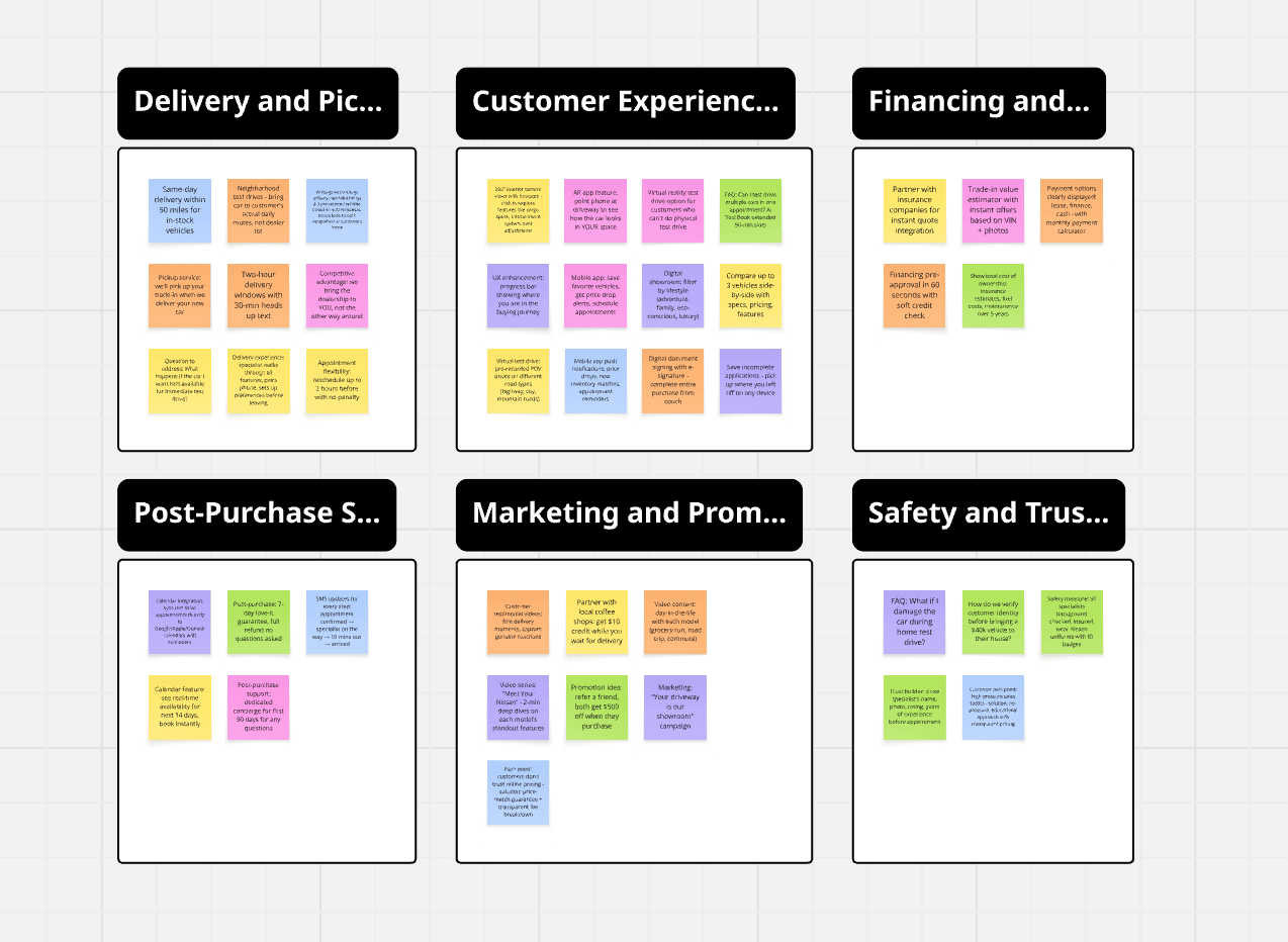
Before jumping into design, I looked at how people actually shop for cars today. I reviewed Nissan’s real website and Drive@Home program, studied popular car-buying apps (like Carvana, CarGurus, and Tesla’s experience), and thought about common pain points: too many steps, confusing filters, unclear pricing, and forms that feel endless.
I also considered mobile-specific behaviors — people are often on the couch or in between tasks, so the experience needed to be fast, scannable, and forgiving if they make a small mistake (like entering the wrong ZIP).
.
Key insights:
- Users want to see vehicles and prices quickly
- Good filtering and sorting are essential
- Clear next steps and reassurance at every stage reduce drop-off
- Trust signals (phone support, clear disclaimers) are very important
Ideation & Sketching
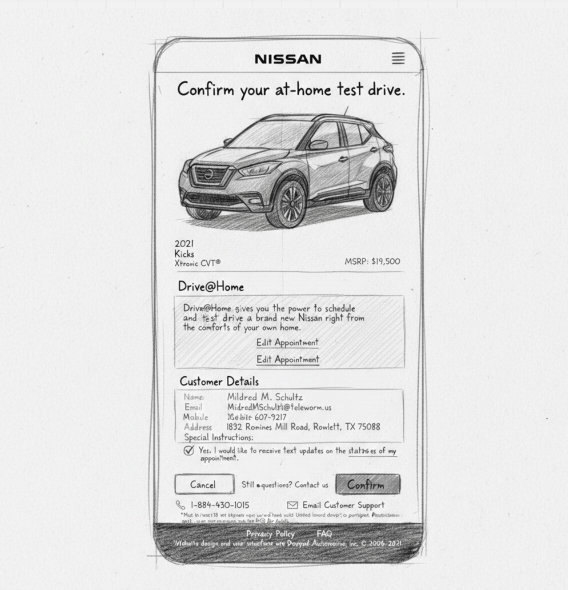
I started with simple paper sketches and low-fidelity wireframes to map out the full flow. I focused on keeping the number of screens reasonable while still giving users enough control.
Wireframes
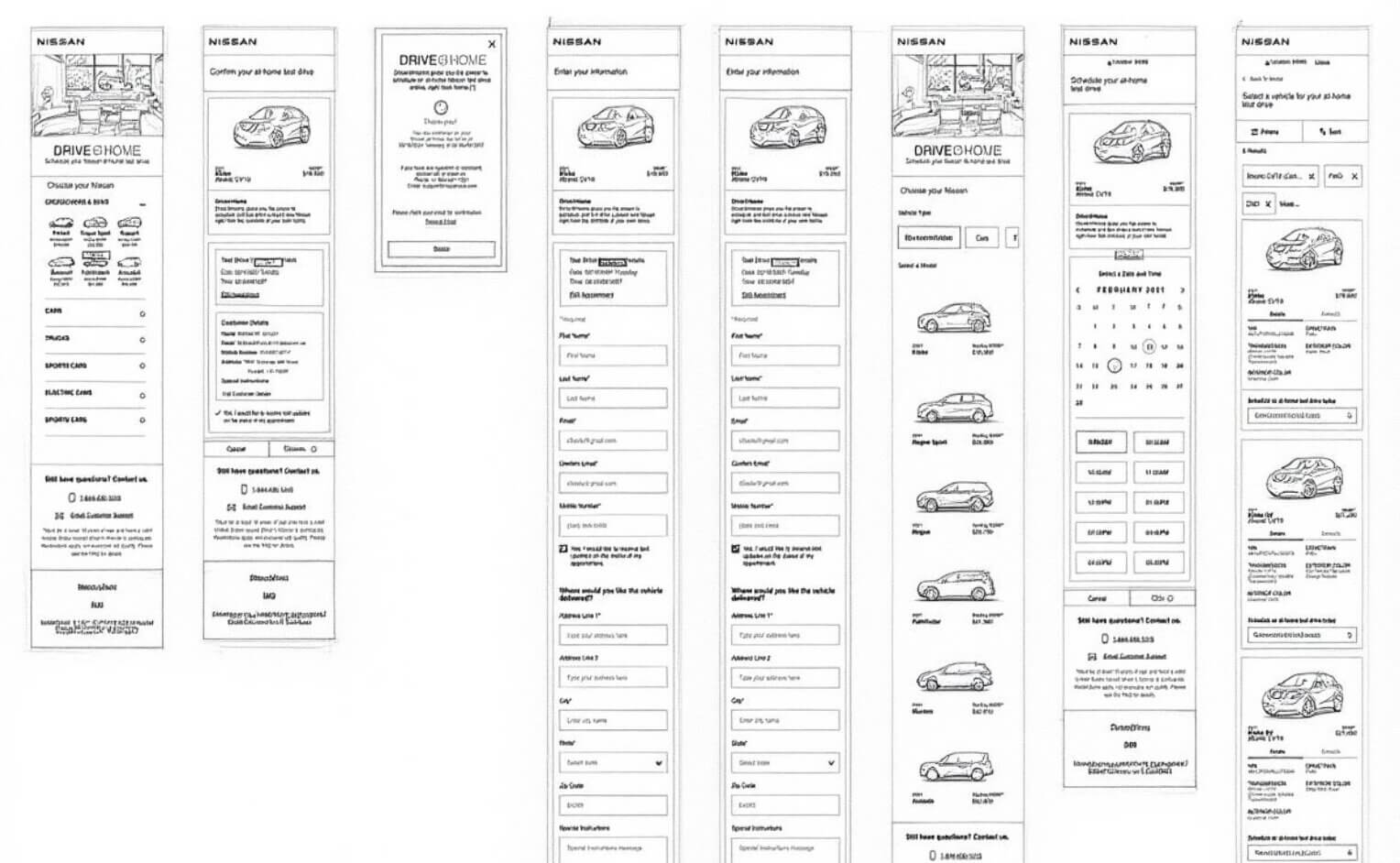
I began with basic grayscale wireframes to test the structure and navigation before adding visuals. This helped me catch flow issues early, like making sure the “Back to Model” option was always easy to find and that users never felt lost after applying filters.
The Solution
The final design is a clean, modern mobile flow that guides users from “I’m curious” to “I have a confirmed test drive” in a logical way. Key features I designed:
- Simple ZIP code verification as the starting point
- Clean model selection with clear pricing and MSRP
- Smart filters (transmission, fuel type, color, etc.) that are easy to apply
- Detailed vehicle view with VIN, drivetrain, colors, and a big prominent “Schedule Test Drive” button
- Intuitive calendar + time slot picker
- Straightforward personal information form with clear error handling
- Confirmation screen with all the details and support contact info
I used Nissan’s brand colors (red accents, black text, clean whites) and made sure the interface felt premium but approachable — like a trusted brand.
Design Evolution
Early versions had more text and denser layouts. Over time I simplified things:
- Made car cards bigger and more visual
- Reduced the number of steps where possible
- Improved contrast and button hierarchy so primary actions (like “Schedule Test Drive” or “Verify ZIP”) stand out clearly
- Added helpful micro-copy like “Drive@Home gives you the power to schedule… right from home” to reinforce the benefit at key moments
I also paid attention to empty states, loading states, and error messages (like invalid ZIP or address not found) to make the experience feel more polished and user-friendly.


Results & Impact
Since this was a concept project, I measured success through usability feedback and flow quality rather than live metrics. After testing the prototype with a few people, the feedback was really positive — users said the process felt straightforward and less intimidating than typical dealership experiences. They especially liked:
- How quickly they could browse and filter vehicles
- The clear visual hierarchy
- The reassuring confirmation and support information at the end
The biggest win was creating a flow that feels respectful of the user’s time and comfort while still collecting all the necessary information for Nissan.