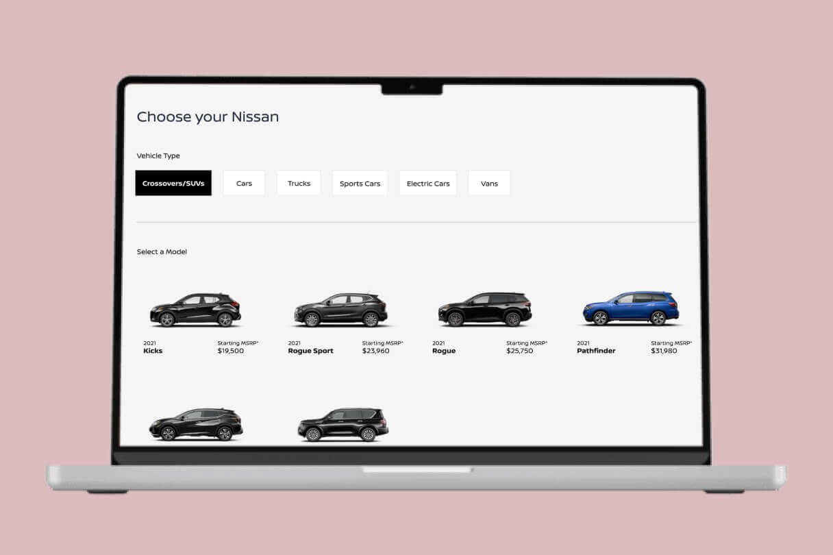
Project Overview
Nissan Drive@Home lets customers schedule a test drive that comes to them—no dealership visit required. I was the sole UX designer tasked with redesigning the end-to-end web experience, from the moment a user enters their ZIP code to the confirmation screen that locks in their appointment.
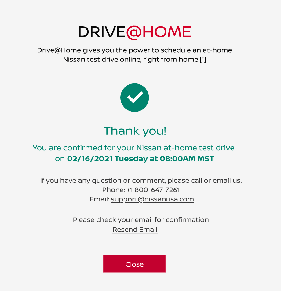
The flow lets users enter their ZIP code, browse and filter Nissan vehicles, select a model, choose a convenient date and time, fill in their details, and receive instant confirmation. My goal was to reduce friction in vehicle discovery, make scheduling feel effortless, and build enough trust that users felt comfortable giving us their time, address, and contact info.
The goal was to make buying (or testing) a car feel simple, modern, and genuinely convenient — from the comfort of your couch.
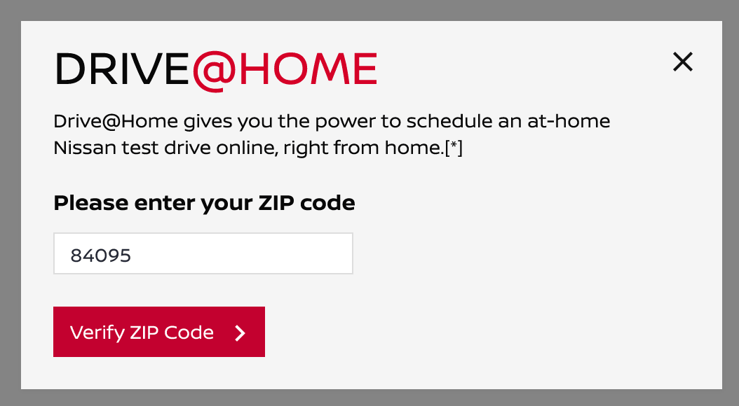
The Challenge
Traditional car shopping can feel overwhelming and time-consuming, with too many steps, confusing options, and dealership pressure. Nissan wanted to offer a better alternative through Drive@Home, but the experience needed to handle real-world complexities without frustrating users.
People don't want to browse 40 cars and manually compare specs. They want to say "I need something spacious for my family, under $30K, and I can only do weekends" — and have the system figure out the rest.
Users need to:
- Quickly find vehicles actually available near them
- Understand what they're getting (trim, specs, color) without digging
- Pick a date and time that works for their life, not just the fleet
- Hand over personal and address details without second-guessing if this is legit
The old experience buried users in filters, dumped them into dense spec sheets, and offered little reassurance once they hit the scheduling and checkout steps.
Key challenges I focused on:
- Information Overload: Users don't want to browse 40 cars. They want to narrow down fast and feel confident in their pick.
- Scheduling Anxiety: Picking a time slot for a home delivery feels higher-commitment than booking a restaurant. Users need clarity on what happens next.
- Trust at Checkout: Asking for home address, driver's license implications, and contact details requires a transparent, error-tolerant flow.
- Edge Cases: Invalid ZIPs, out-of-service areas, and address mismatches needed graceful recovery—not dead ends.
My Role
I was the sole UX Product designer for this project, but my scope went beyond traditional screen design. I took ownership of the entire experience:
- Designed the complete user flow from landing page to confirmation
- Created all screens including vehicle selection, filtering, scheduling, and checkout
- Designed personalization logic — how the system learns preferences, and adapts the experience in real time
- Focused on making complex steps feel effortless
- Built an interactive prototype to showcase the smooth, intelligent end-to-end journey
- Collaborated with engineering on feasibility for real-time inventory and calendar availability
User Research
I studied Nissan's existing Drive@Home program along with leading car-buying experiences like CarMax, Carvana, and traditional OEM sites.I paid special attention to how users research cars online and what causes them to drop off during scheduling or checkout.
Important findings:
- Users want to see vehicles and pricing quickly with easy filtering — but even more, they want relevant results surfaced proactively
- Clear progress steps and reassuring messaging build trust
- Forms should be broken into logical sections with helpful error messages
- Support contact info should be visible at every stage for peace of mind
The Solution
A clean, three-step web experience that respects the user's time:
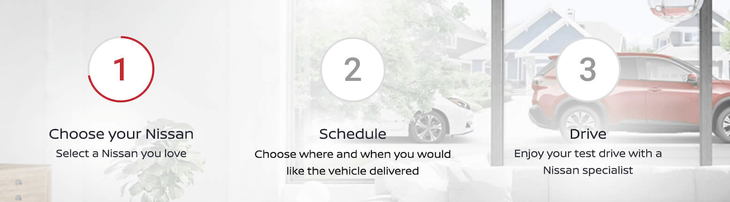
1. Find Your Vehicle
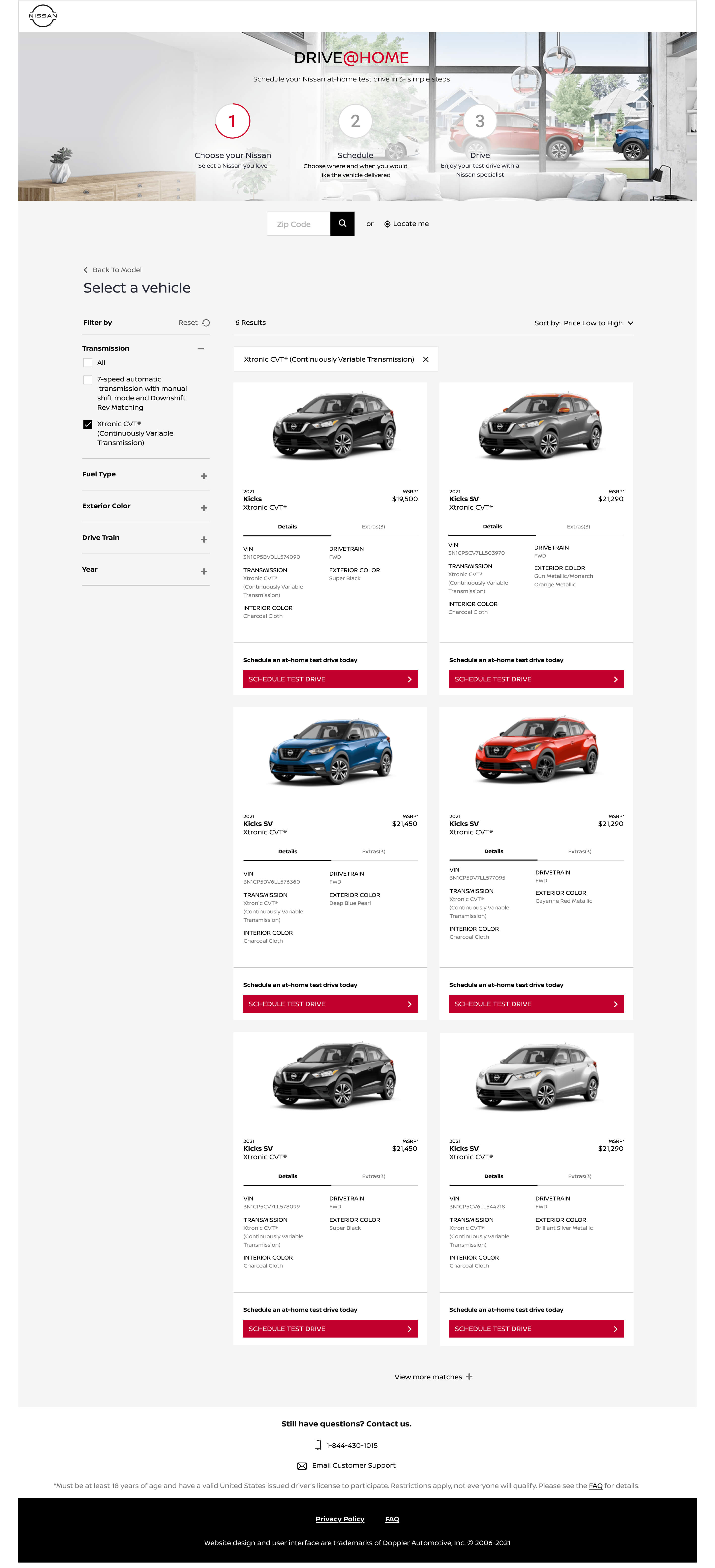
- Natural entry point: ZIP code verification upfront so users only see available inventory
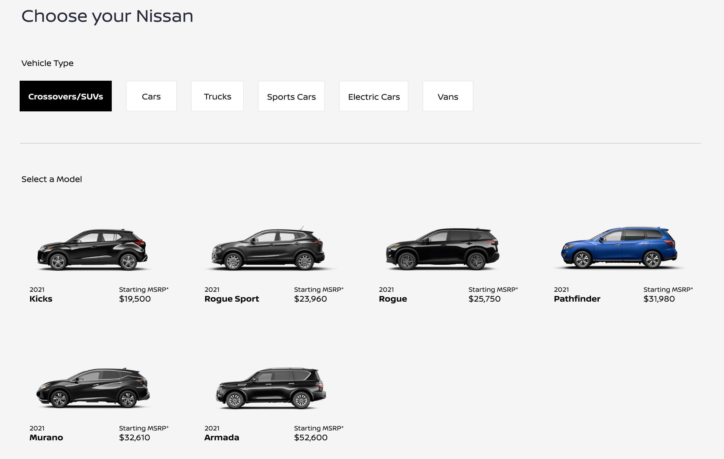
- Category tabs (Crossovers/SUVs, Cars, Trucks, Electric, etc.) for quick mental models
- Collapsible filters (Transmission, Fuel Type, Exterior Color, Drive Train, Year) for power users, but not gatekeeping the results
- Sorting by price and clear MSRP callouts so there's no sticker shock later
- Vehicle cards surface the details that matter most for quick scanning.
2. Schedule Your Drive
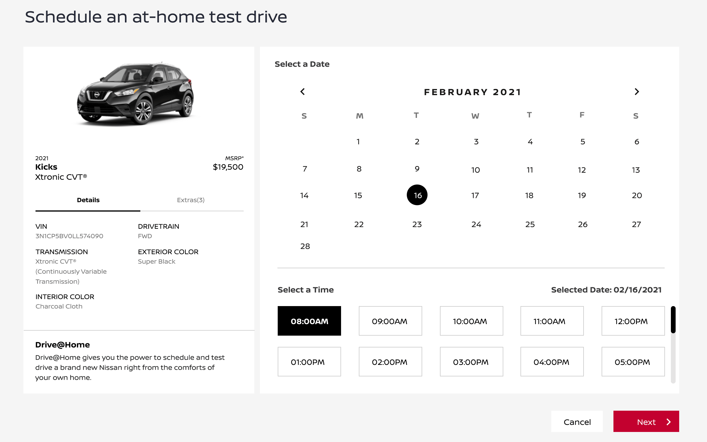
- Side-by-side vehicle summary + calendar view so users never lose context on what they're booking
- Monthly calendar with clear available/taken states
- Time slots in 1-hour increments, with visual priority on high-availability windows
- Date confirmation so there's no ambiguity before moving forward
3. Confirm & Book
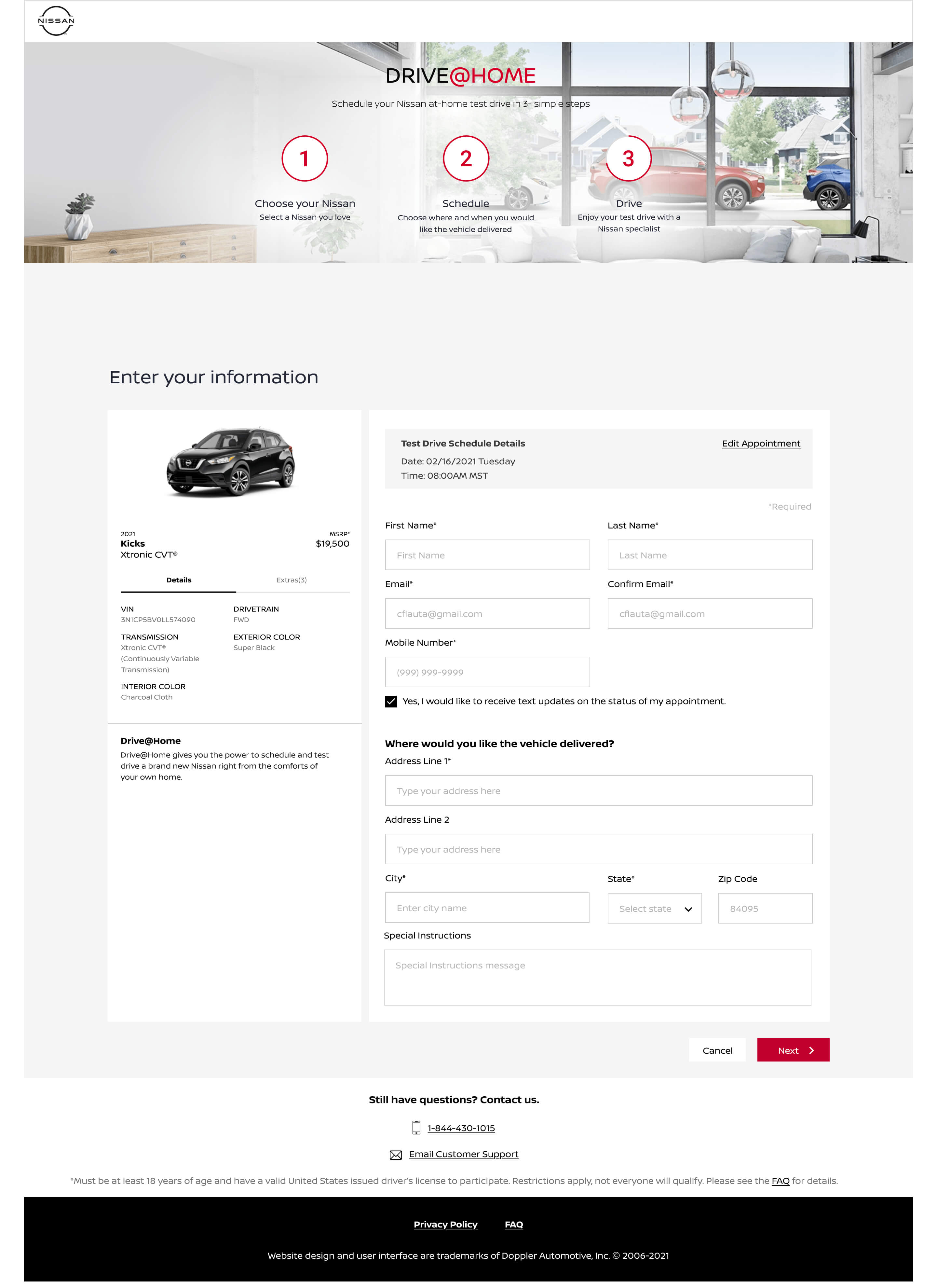
- Two-column layout: vehicle details on the left, form on the right—so the user always sees what they're committing to
- Logical form grouping: Name/Contact → Delivery Address → Special Instructions
- Pre-filled ZIP code from earlier to reduce repetition
- Persistent support contact (phone + email) at every step for peace of mind
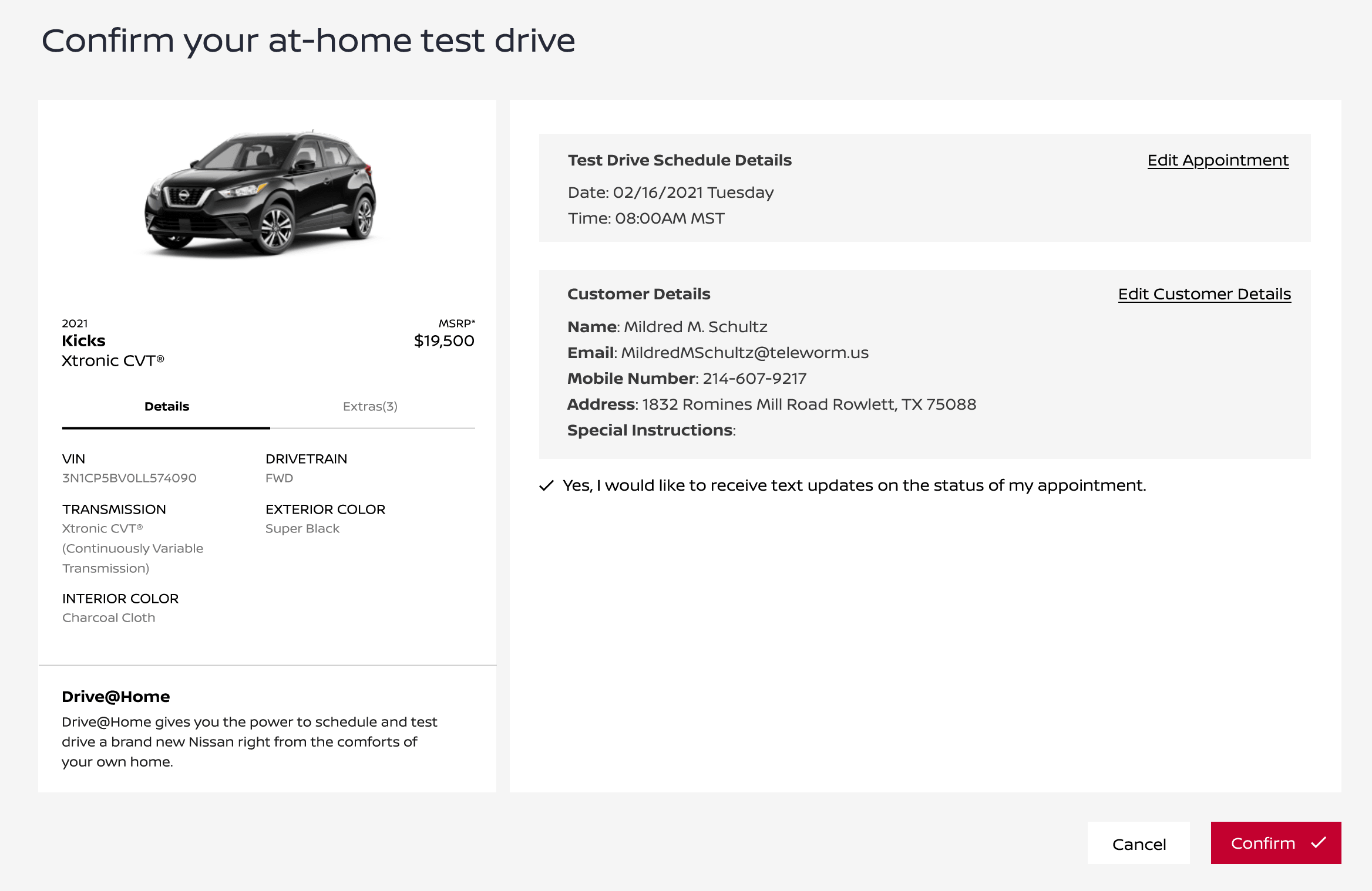
- Edit links at confirmation so users can fix mistakes without starting over
Key Design Decisions
Smart defaults over empty states
Instead of dumping users into a blank grid, the ZIP code gates the experience. Once verified, results are already filtered by local inventory. The "Sort by Price Low to High" default respects the research phase most buyers are in.
Progressive disclosure in filters
The filter panel uses expandable sections. Most users scan, some compare. This keeps the UI breathable while still supporting detailed comparisons for users who want them.
Calendar + time slot pairing
I kept the calendar and time slots on a single screen. Splitting them into separate steps added unnecessary clicks. The selected date echoes back at the top of the time slot list so users don't have to remember what they picked.
Error handling that offers a path forward
I designed error states to recover users instead of losing them. When a ZIP code falls outside the service area, the screen explains why, collects contact details, and routes them to a nearby dealer—no dead end. If an address doesn't validate, the error calls out the specific problem and surfaces the support number right there, so help is one tap away instead of a hunt through the footer.
Trust signals baked in, not bolted on
Trust was built into the flow itself, not treated as decoration. A short "What is Drive@Home?" block on the scheduling page reassures users this is a real Nissan program, not a third-party trap. Required fields are marked clearly but quietly, and the confirmation page shows a full booking summary with inline edit links—so users feel in control, not anxious about what they just committed to.
What I'd Measure:
- Time-to-schedule: Target under 3 minutes from ZIP entry to confirmation
- Filter-to-selection rate: Are people finding cars faster with the new category tabs?
- Form completion rate: Did reducing field friction and adding inline validation improve checkout?
- Support ticket volume: Specifically around "is this available in my area?" and address validation errors
- Drop-off by step: Calendar vs. form vs. confirmation to find remaining friction
What I Learned
Design for the edge cases first. The happy path is easy. The ZIP code that fails, the address that doesn't validate, the time slot that just got taken—these moments define whether a user trusts your brand or bounces. I spent disproportionate time on error states and recovery flows, and it made the whole experience feel more robust.
Context is everything. Users booking a home test drive are not in "browsing" mode. They're in "planning" mode. Every screen needs to answer: What am I booking, when, and what happens next? The persistent vehicle summary and appointment details on the right rail came directly from that insight.
Forms are part of the product, not an afterthought. The personal info and address form could have been a generic checkout. Instead, I treated it as a continuation of the conversation: clear section headers, logical grouping, and a checkbox for text updates that gives users control over communication. Little moments of respect add up.
This project reminded me that "simple" is usually the result of hiding complexity, not avoiding it. The three-step flow looks obvious in retrospect, but getting there meant making hard cuts on what information to surface when—and trusting users to move faster when you get out of their way.