Project Overview
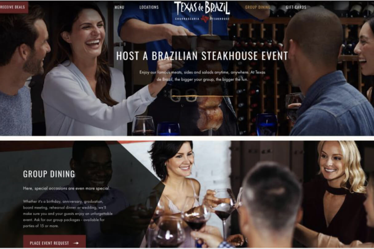
I conducted a full heuristic evaluation of texasdebrazil.com (desktop version) to identify usability issues that could frustrate users trying to explore the menu, book tables, order online, buy gift cards, or join the e-club. Texas de Brazil is a high-end Brazilian steakhouse known for its flame-grilled meats and expansive salad bar. The evaluation focused on seven real-world tasks a new user might perform, using Jakob Nielsen’s 10 Usability Heuristics. I documented both positive strengths and negative issues with severity ratings, screenshots, and clear recommendations.
My Role
I performed the complete heuristic evaluation as the sole UX designer:
- Planned and executed the evaluation using Nielsen’s heuristics
- Tested seven key user tasks as a first-time visitor
- Analyzed findings, assigned severity ratings, and provided actionable recommendations
- Delivered a 32-page professional report with screenshots and prioritized fixes
The Challenge
Restaurant websites often feel overwhelming or confusing — users just want to quickly browse the menu, book a table, or buy a gift card without friction. Texas de Brazil’s site had strong visual appeal but suffered from inconsistent navigation, hidden features, unclear feedback, and accessibility issues that could cause drop-offs or frustration.
Key challenges identified:
- Tiny or unclear interactive elements
- Inconsistent terminology and styling
- Poor error prevention and recovery
- Hidden or hard-to-find features like FAQ
My Research Process
I followed a structured heuristic evaluation process:
- Explored the site as a new user while completing seven realistic tasks (explore menu, book table for 1–7 people, group booking, order online, buy gift card, join e-club, search for help/FAQ)
- Evaluated every task against Nielsen’s 10 Usability Heuristics
- Used a clear 5-level severity scale: Positive → Cosmetic → Minor → Major → Terrible Issue
- Captured screenshots and noted exact pain points with recommendations
This method allowed me to quickly uncover usability problems without needing a full user testing round.
Evaluation Findings
The site performed well in some areas (strong branding, clear terminology, and helpful error messages in plain language). However, I found significant issues across most heuristics:
Major & Terrible Issues included:
- Tiny, hard-to-click icons and carousels with no disabled states
- Calendar allowing past dates
- Inconsistent button styling and labeling
- Form fields with disappearing labels and no real-time validation
- No visible card type indicators until after submission
- Hidden FAQ in the footer
Positive highlights:
- Good system status feedback during gift card purchase
- Familiar icons and real-world language
- Clear “Back” options and undo-like resets
The Solution (Key Recommendations)
I provided targeted, practical fixes for every issue:
- Make all interactive elements (icons, labels, carousels) larger and clearly clickable
- Show item names and images on hover for better recognition
- Add real-time validation and visible labels on forms
- Display acceptable payment card icons upfront
- Improve consistency in navigation, dropdowns, and modals
- Move FAQ to top navigation and add search functionality
- Prevent past dates in the calendar and fix group booking minimums
Many fixes were low-effort (label changes, hover states, button consistency) but would deliver big improvements.
Results & Impact
This evaluation clearly highlighted 10+ major usability blockers that were preventing smooth user journeys. By prioritizing Terrible and Major issues, the UX team now has concrete, prioritized recommendations to guide the next redesign or development sprint.
Stakeholders can immediately use these findings for:
- Faster formal usability testing scenarios
- Targeted fixes that improve conversion on table bookings, gift card sales, and e-club sign-ups
- A more professional, user-friendly experience that matches the premium feel of Texas de Brazil restaurants
The report turned a subjective review into an objective, actionable roadmap — exactly what design and development teams need.